Care/of Brand Evolution
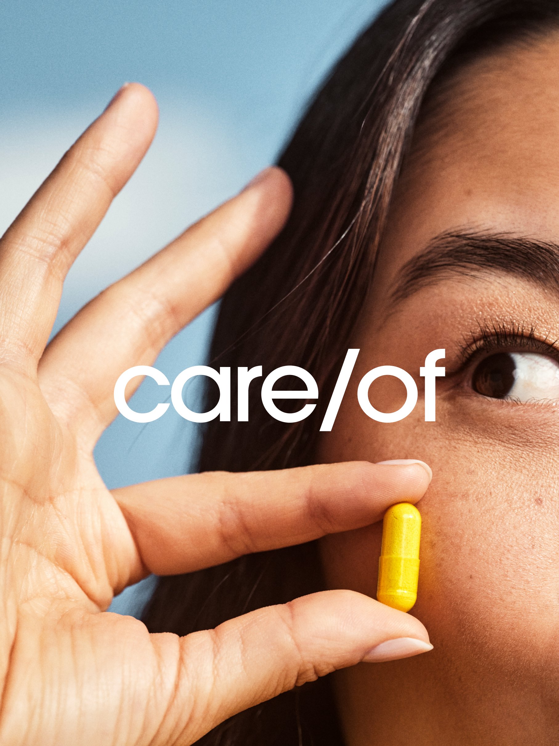
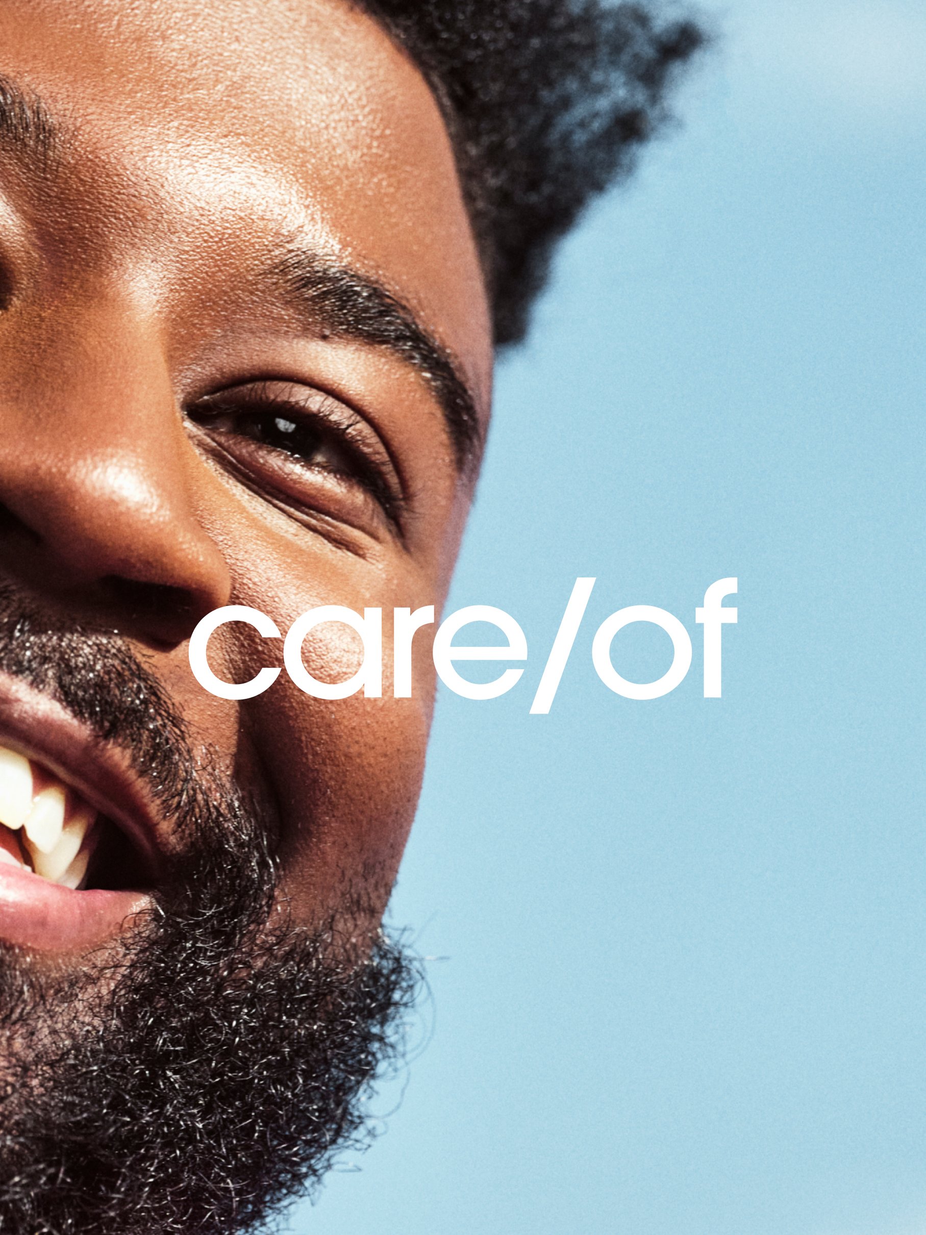
When Care/of launched, its visuals were grounded in friendliness, approachability and convenience. As our brand has evolved and we’ve learned more about our target customer, Lexi, we’d like to focus more on our purpose towards making it simpler to thrive and helping her see results. The supplements market is also much more crowded than it was 6 years ago—how can Care/of stand out?
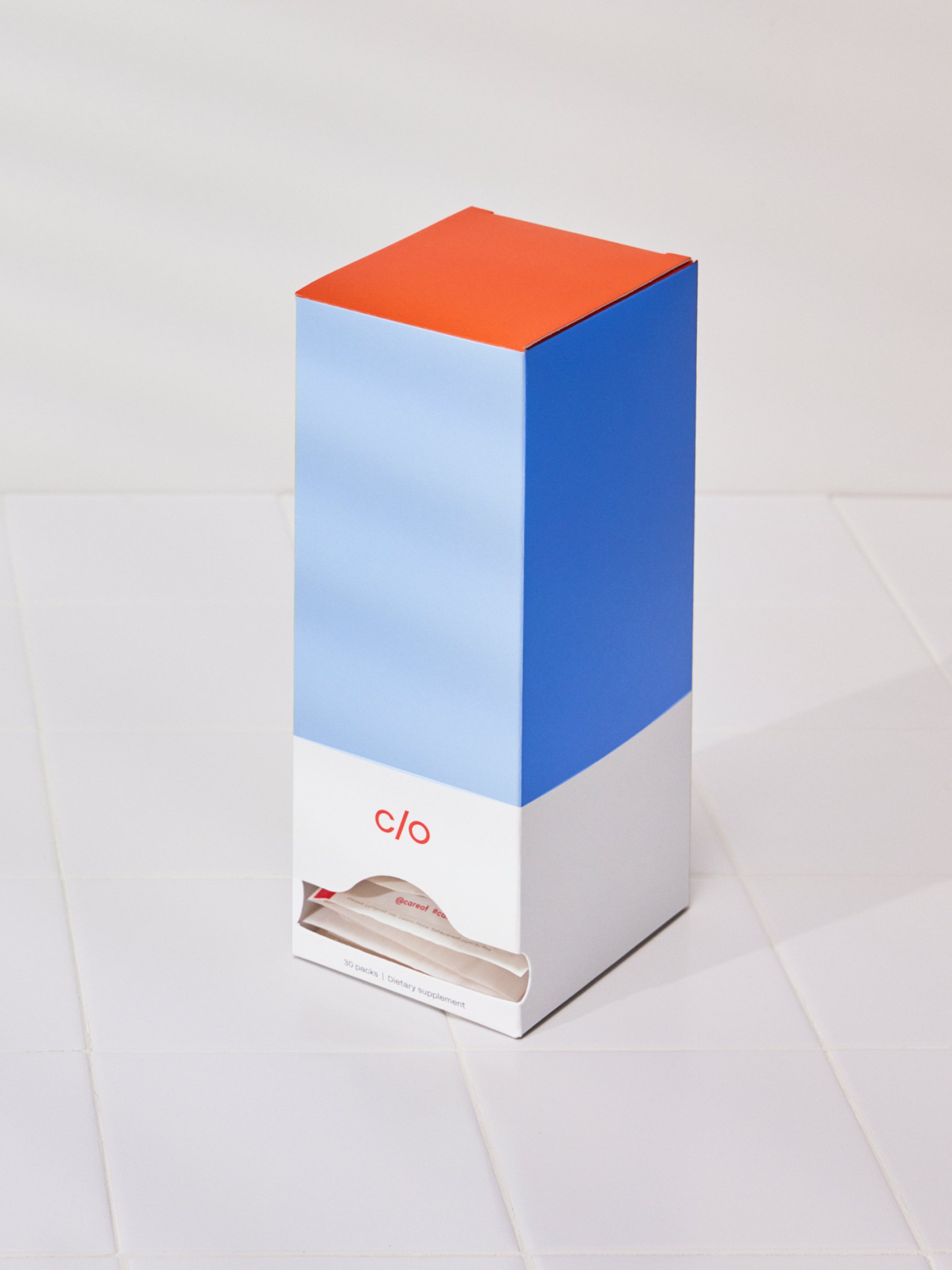
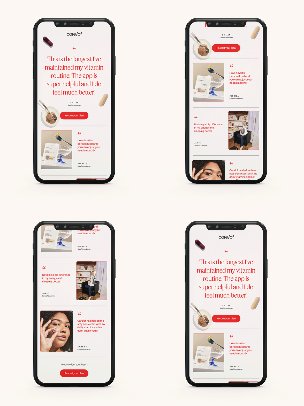
As such, we revisited our brand identity with the goal of ensuring our visuals support our new brand strategy, creating more differentiation in the market with a more identifiable brand, and ensuring we’re considering scalability and consistency.

